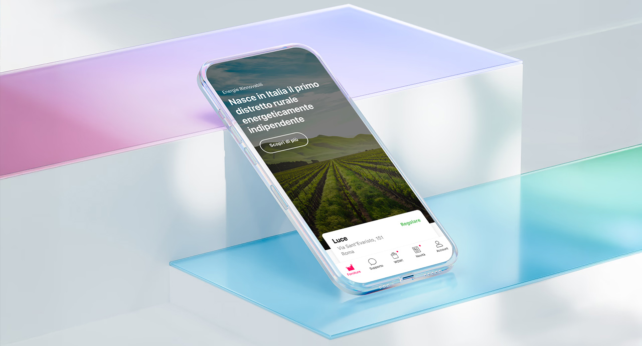
Enel Energia operates inside a business shaped by regulation, infrastructure, and a customer base that ranges from first-time app users to people managing multiple properties. The app had to work for all of them, inside constraints none of them could see.
Enel Energia App
Year
2019
Type
Utility
Role
Lead Designer
Overview
Opportunity
The Constraint Was Comprehension
Energy is abstract by nature: kilowatt-hours, tariff bands, billing cycles most people never think about until something goes wrong. The interface wasn't the hard part. Making an inherently technical service feel legible to a general audience was.
The real opportunity sat in the gap between what the business needed to communicate (regulatory information, billing accuracy, service changes) and what a household actually wanted to know: am I paying too much, and can I fix it.
Vision
Effortless Is a Business Outcome
An app that feels effortless isn't a design nicety here. It's what keeps a customer from calling support, switching providers, or ignoring a bill until it becomes a problem. Every screen had to earn its place by removing a reason to disengage.
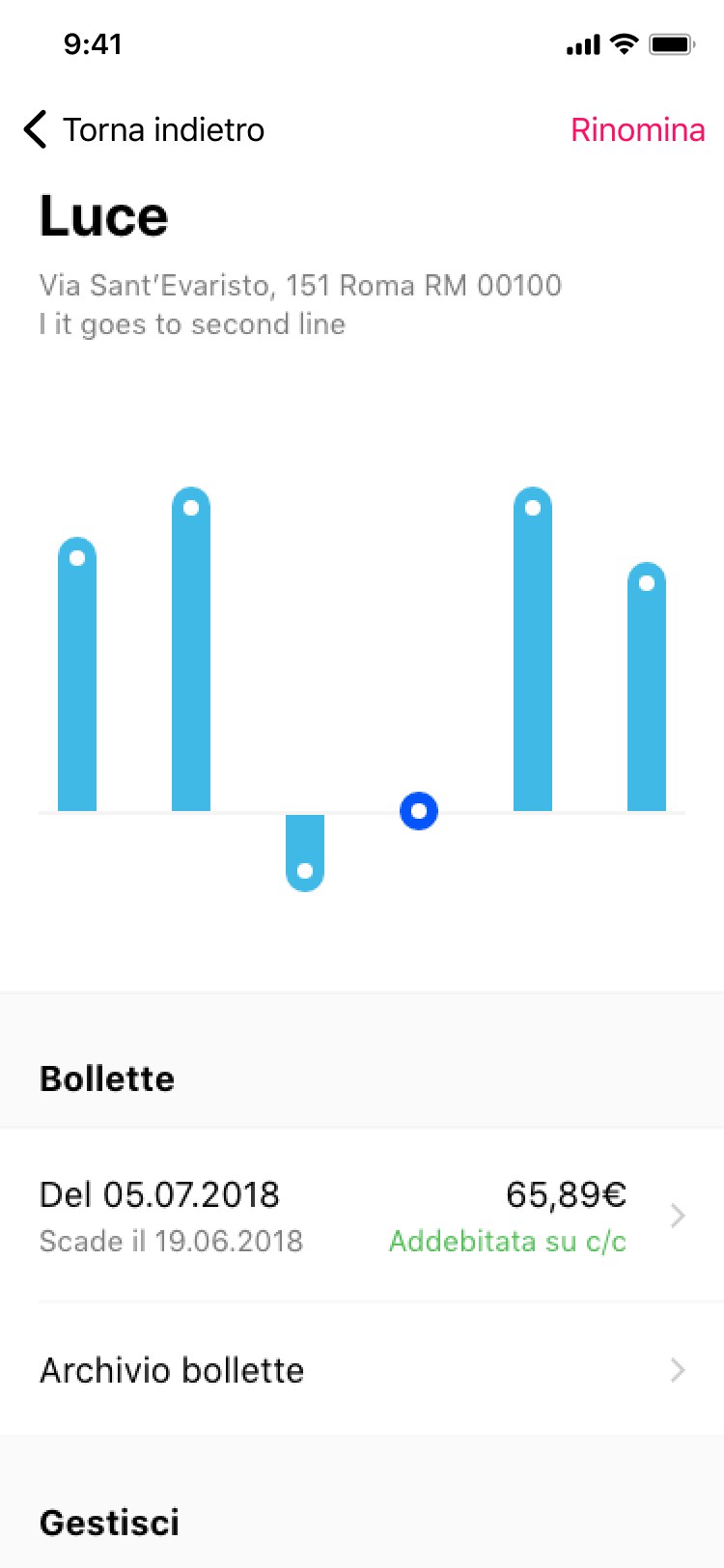
The response converted raw consumption data into decisions people could actually act on, rather than numbers they'd scroll past.
Principles
Clarity as the Product
Interface Redesign
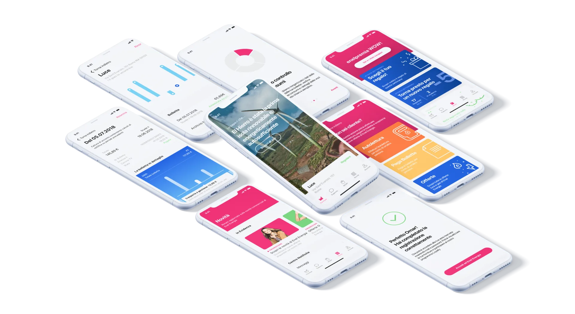
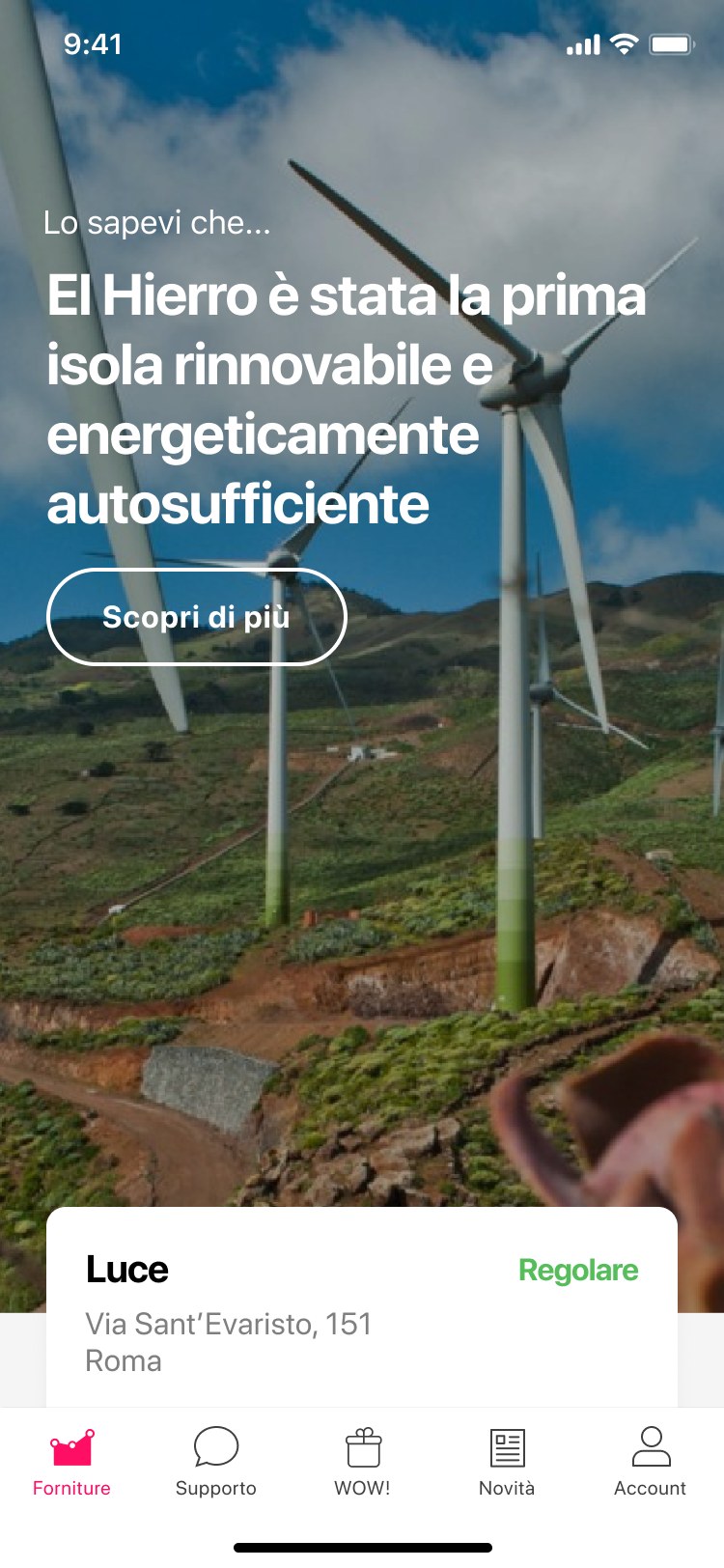
A visual language built around what needed attention first: consistent enough to feel familiar to returning users, direct enough to need no explanation.
Accessibility
Built for the full range of the customer base, from digital-native users to people opening a utility app for the first time.
Data Legibility
Consumption and billing data translated into graphics that explain themselves: no manual required, no assumption of prior knowledge.
Service Consolidation
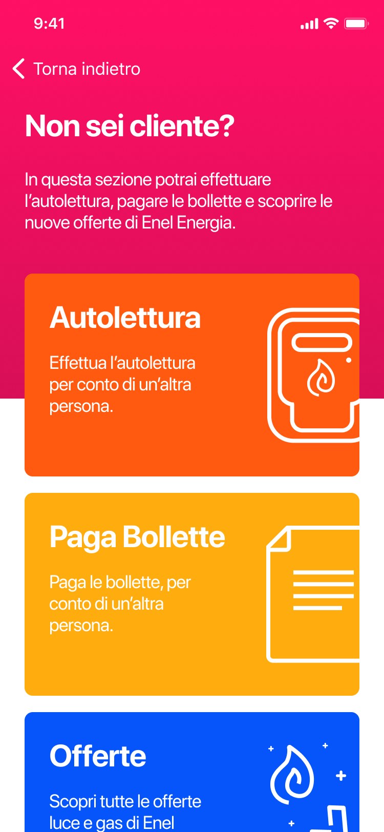
Billing, meter readings, loyalty, and activations: separate systems internally, one coherent flow for the person using the app.
Tap through the app. Every screen is live.
What I Learned
Design Inside Someone Else's Constraints
The project was a lesson in designing around constraints that weren't design decisions: regulatory language, legacy billing systems, infrastructure that predated the app by decades. The job was translation as much as interface work.
What carried forward was a design system built to stay consistent with Enel's broader digital presence, so the next constraint wouldn't mean starting over.
Credits
- Client
- Enel Energia
- Agency
- Imille
- Role
- UX/UI Designer
- Scope
- UX · UI · Loyalty
Let's talk
Need this kind of thinking on your next project?
 Omar Mootamri
Usually replies within a day
Omar Mootamri
Usually replies within a day