HealthUI DesignRedesign

Allimb

Year 2024
Type Health
Role Visual & Creative Digital Designer
Allimb

Allimb sits inside a context where trust is the actual currency: people recovering from injury, guided by physiotherapists who need clinical precision, using a product that also has to feel encouraging on a hard day. Get the tone wrong in either direction and the product fails.

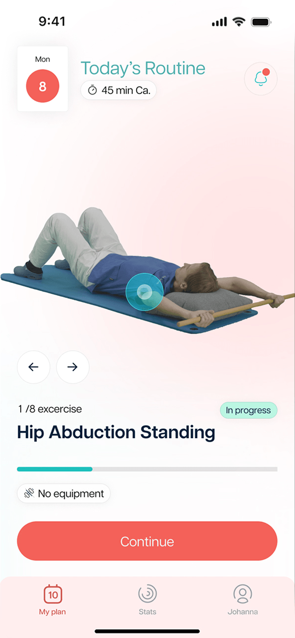
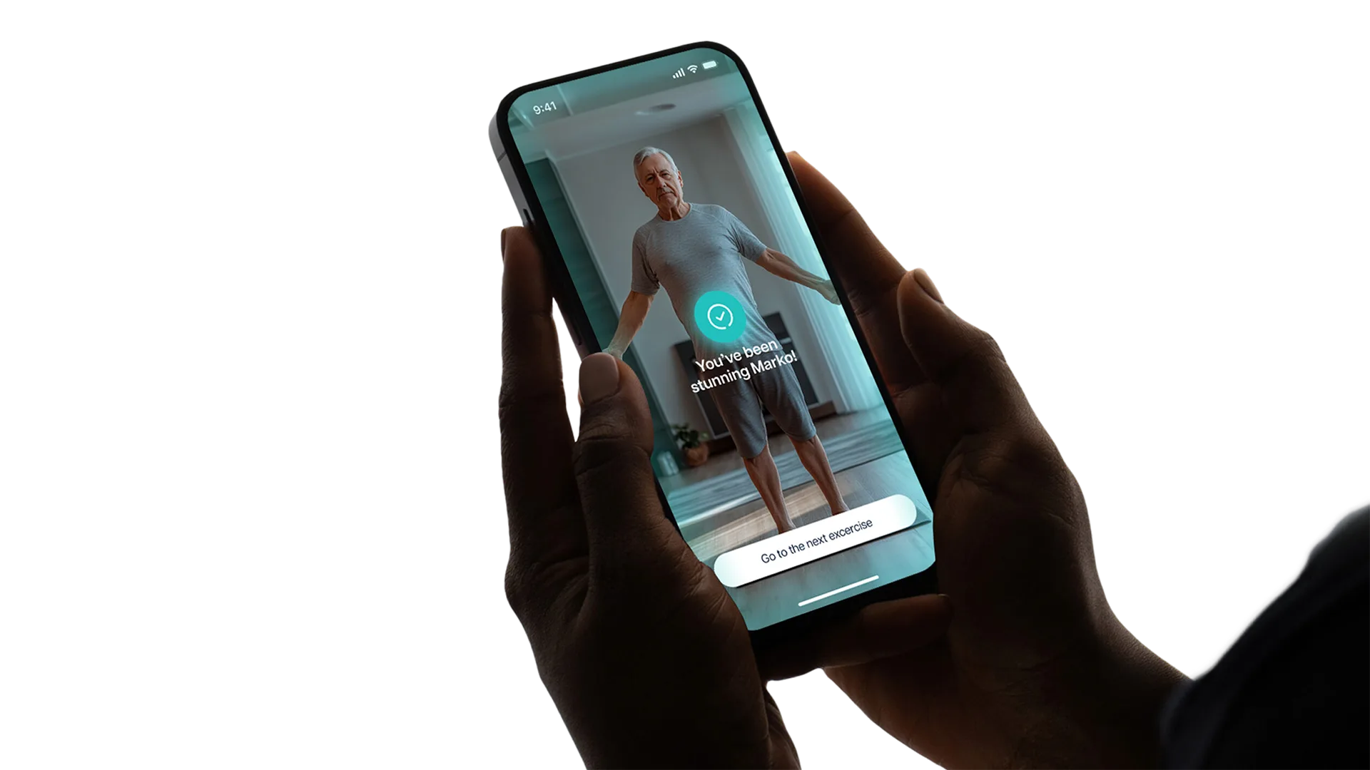
Patient-facing app home screen: personalised exercise plan overview with AI-guided daily goal, progress ring, and next-session prompt

Two Users, One System

The transformation spanned a full patient app, a new digital presence, and professional tools for physiotherapists managing rehabilitation programmes: three surfaces, two fundamentally different mental models to design for.

Patients needed motivation and simplicity. Physiotherapists needed precision and control. The real challenge wasn't designing either. It was designing both inside one coherent product without compromising either.

Medical Precision, Without Clinical Coldness

The response had to hold two truths simultaneously: enough clinical rigour that physiotherapists could trust the data, and enough warmth that patients wouldn't feel like a case number on a hard recovery day.

Every decision was tested against trust, because in healthcare, a design choice that reads as careless costs more than aesthetics. It costs credibility.

Visual identity: calm colour palette (soft blues, warm whites, precise greys) with trust-signalling typography shown at multiple scales
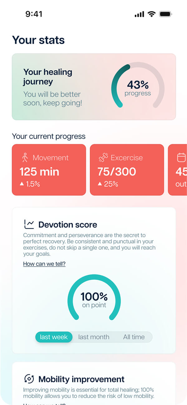
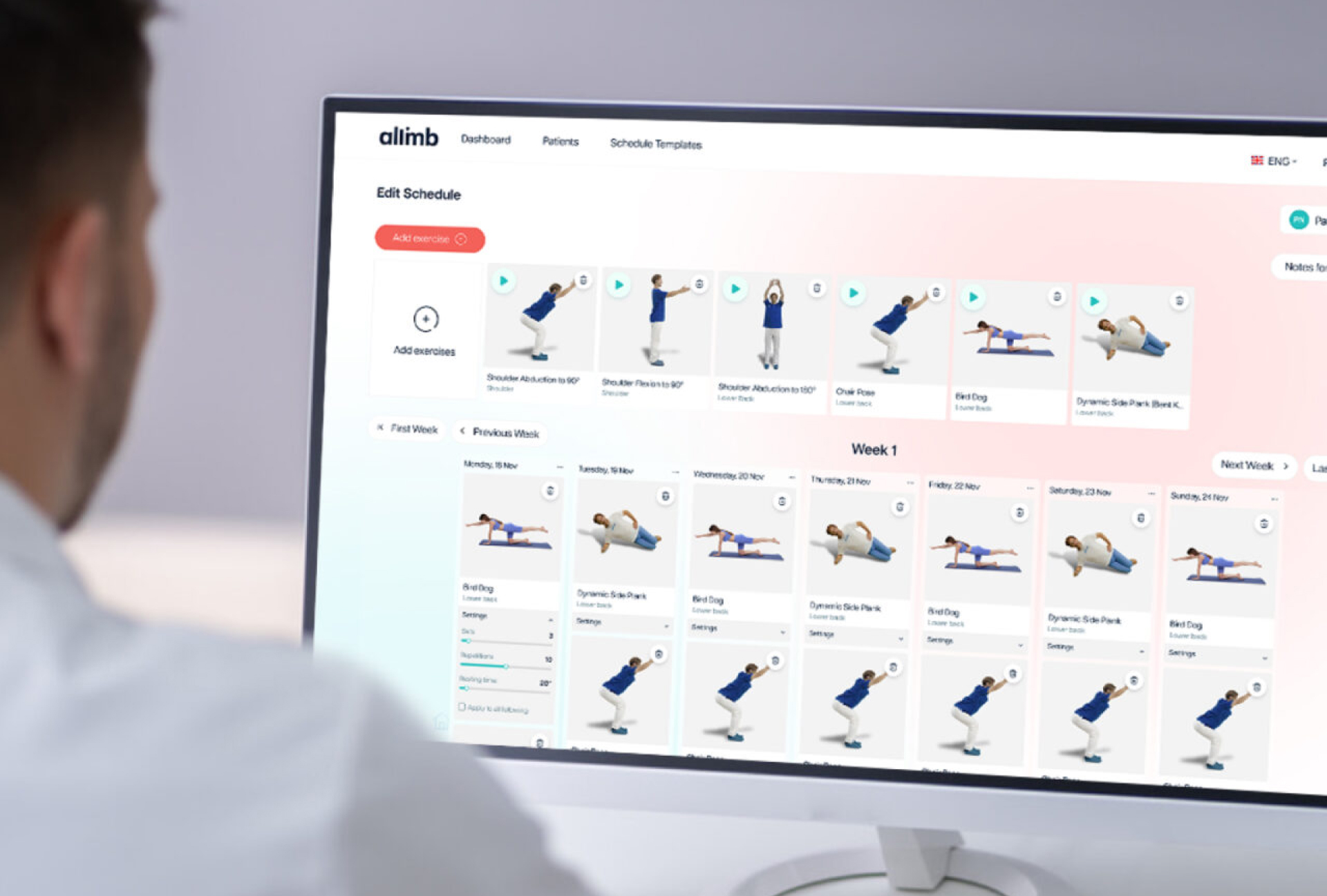
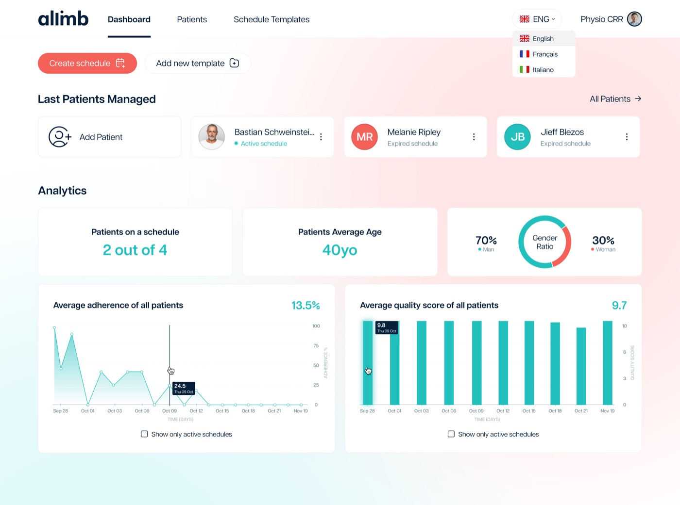
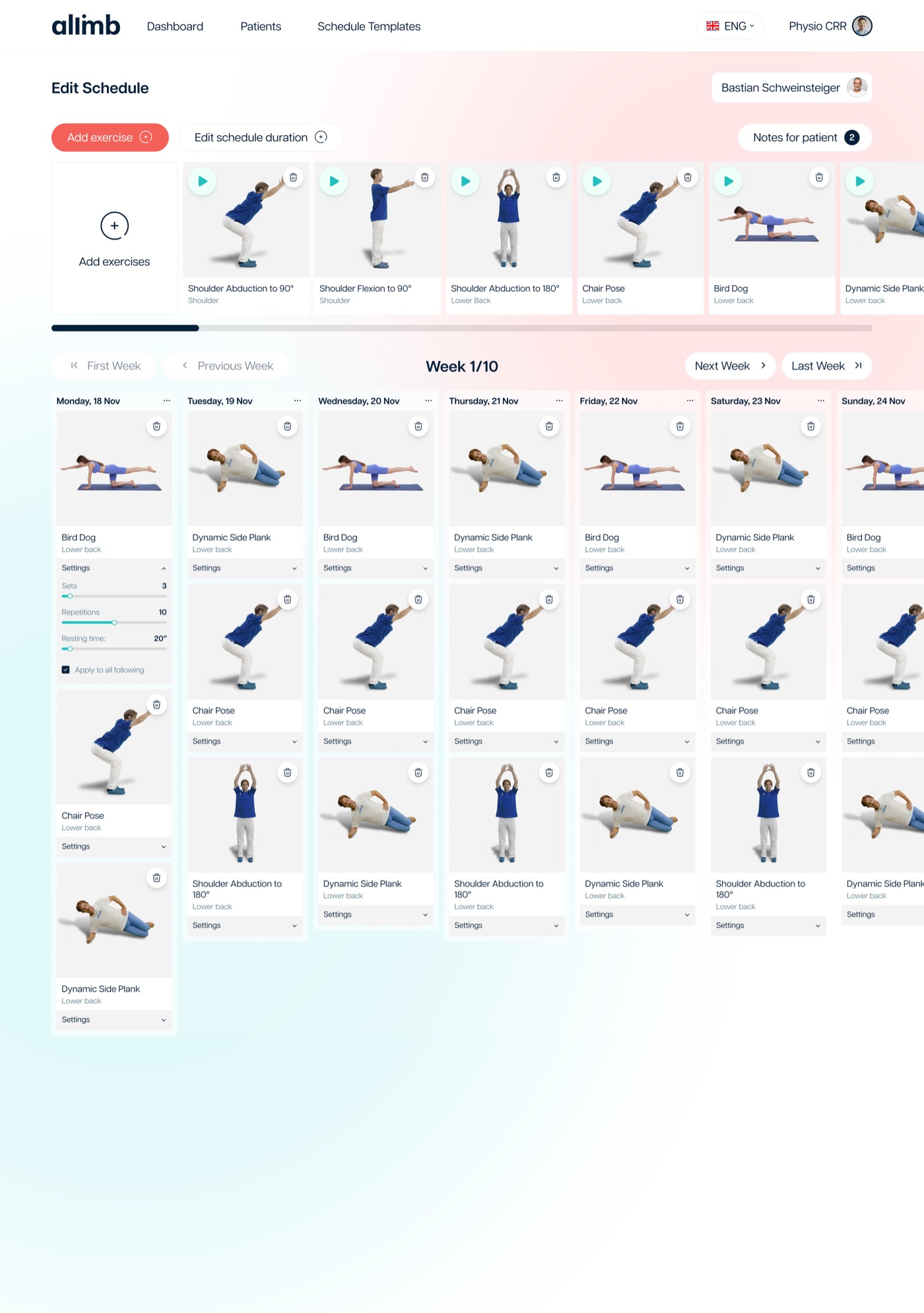
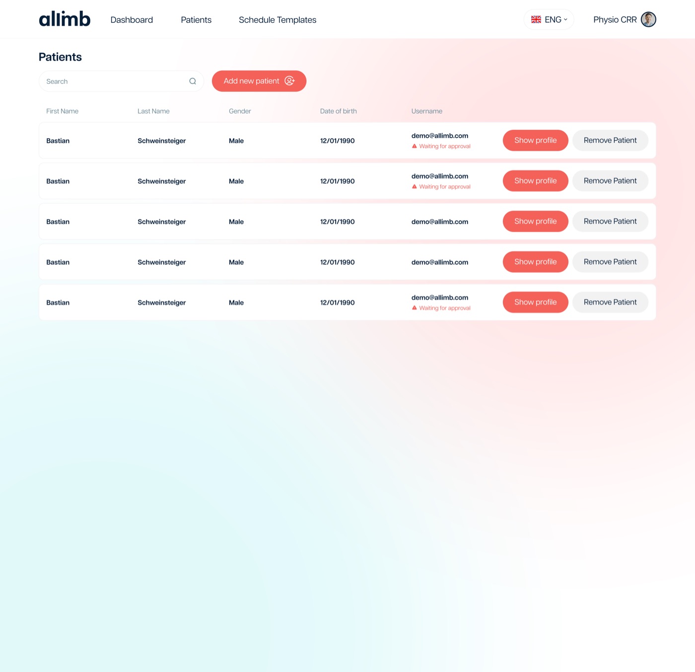
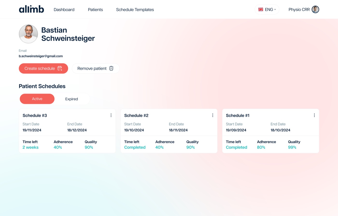
Healthcare professional dashboard: rehabilitation programme management interface showing patient list, session status, and progress metrics

Building Confidence Through Clarity

Dual Research Track
Research run in parallel with patients and physiotherapists: two groups with opposite priorities and almost no overlap in what 'useful' meant to each.
Unified Ecosystem
Patient app, web presence, and professional dashboard built as one coherent system, connected by tone and logic, not just a shared visual style.
Visual Identity
A calm, precise palette that reads as medically credible without tipping into clinical detachment.
Interaction Design
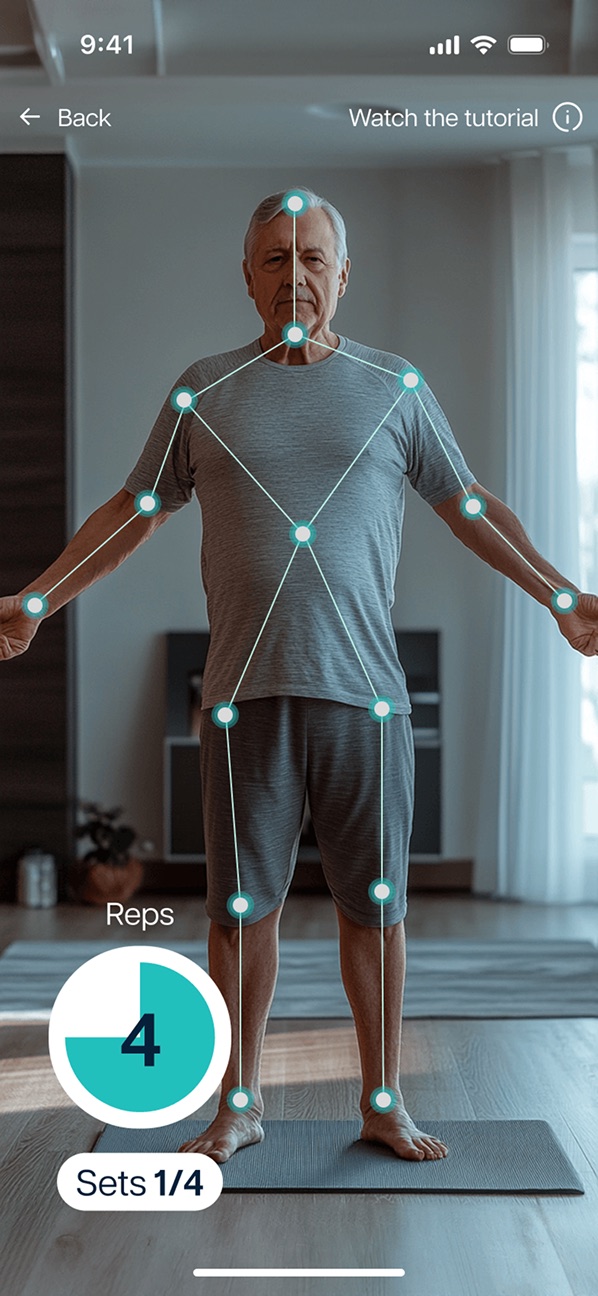
Recovery patterns designed to reduce friction and sustain adherence. The goal wasn't engagement for its own sake. It was showing up again tomorrow.
Digital ecosystem spread: patient mobile app and professional web platform side by side, demonstrating unified design language across both surfaces

Design as a Trust Mechanism

Healthcare products don't earn trust through polish. They earn it through consistency between what the product says and what it delivers. That discipline shaped every screen more than any visual decision did.

The real measure of success wasn't usability metrics. It was whether someone felt capable enough to open the app again the next day.

Next project

Mooney Go
MobilityUI DesignDesign System 2023
View project