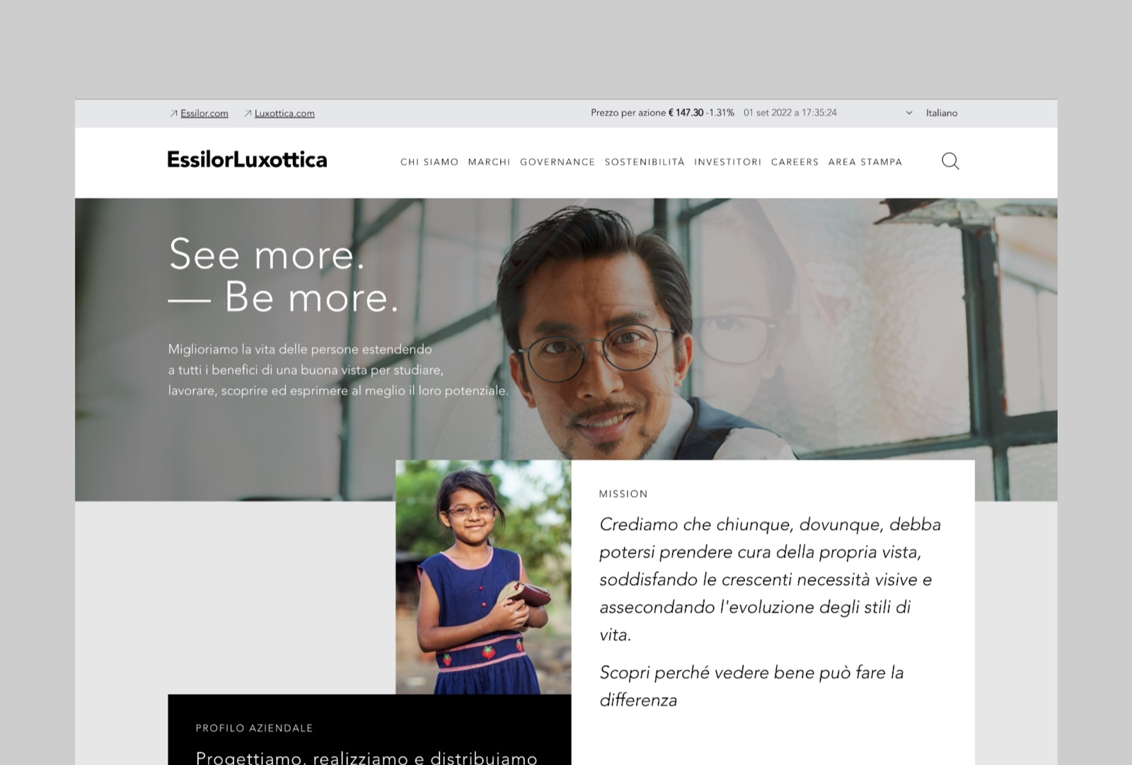
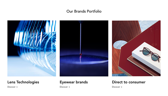
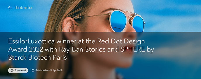
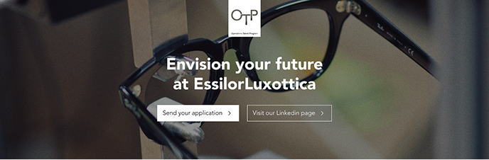
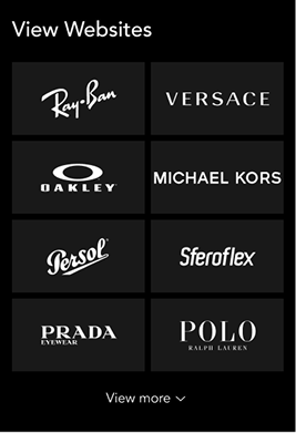
EssilorLuxottica formed in 2018 from the merger of two category leaders (one in lenses, one in frames), each with its own history and its own portfolio of brands beneath it. The corporate site had to represent a group, not flatten one.
Essilor Luxottica
Authority Without Erasure
The business reality: a parent company needed a digital presence strong enough to represent the scale of the merger, without competing with, or diminishing, the many recognisable brand names it now carried.
The tension sat in hierarchy: how does a corporate identity assert itself while leaving room for everything it holds underneath?
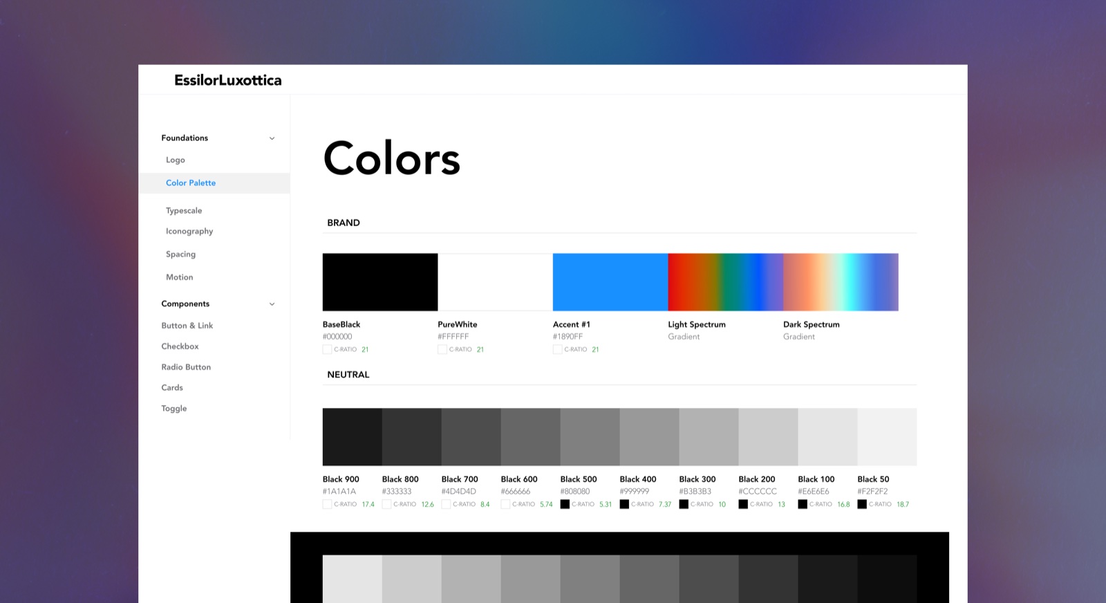
Light as the Unifying System
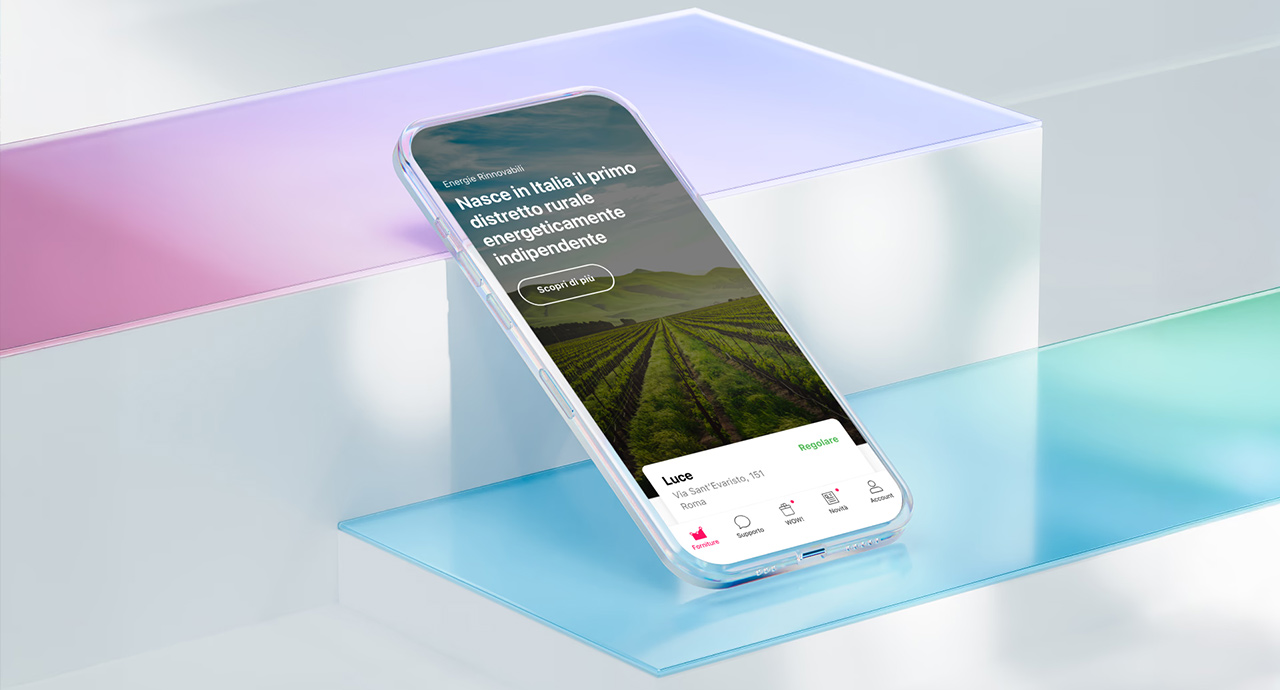
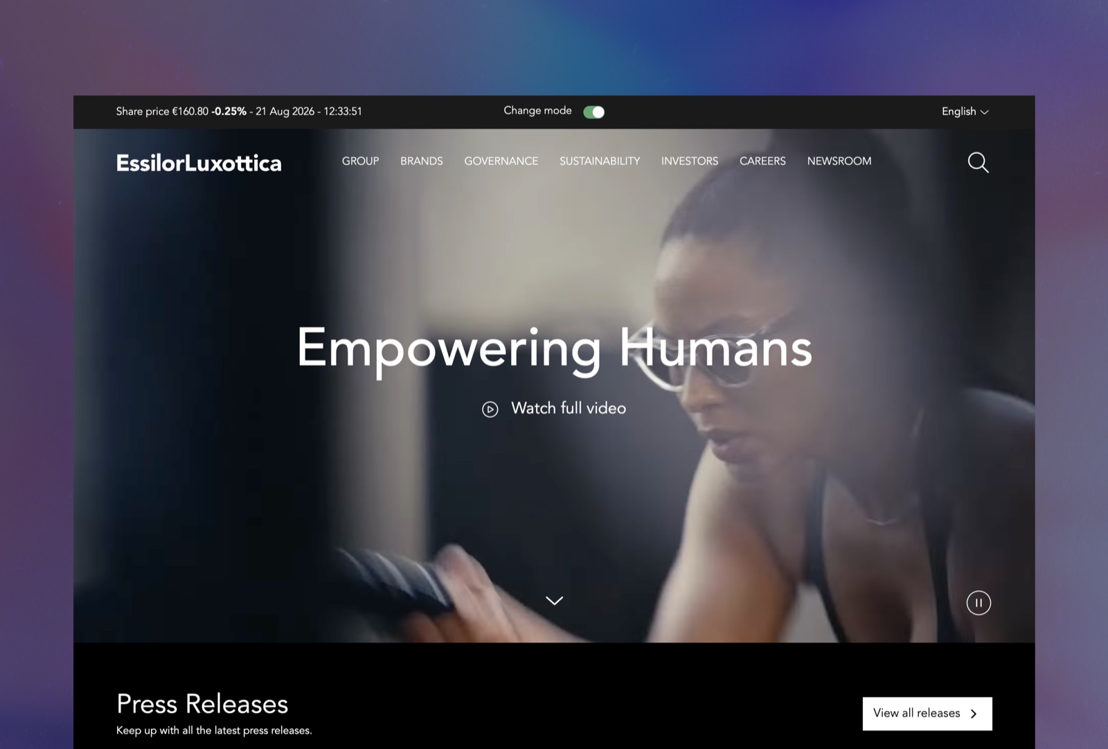
Rather than choosing a single corporate colour (the default move for most groups this size), the direction drew from the physics of the product category itself: how light moves through a lens. An iridescent system, restrained by a monochrome base, gave the brand a way to feel premium without competing for attention.
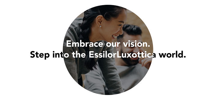
Dual circular iconography, echoing both eyes and lenses, became the connective thread across a portfolio that otherwise had very little visual overlap.
A System Built to Share the Stage
The Most Powerful Move Was Restraint
At this scale, design isn't about dominance. It's about orchestration. The system had to hold authority and generosity at once: strong enough to represent the whole, open enough to let each part still be seen.
The strongest decisions in the project were often the ones that held back rather than added.