
MooneyGo entered a market shaped by habit: commuters who already had a system that worked for them, in MyCicero. The business context was an acquisition; the real context was thousands of people who didn't ask for change. The task wasn't merging two apps. It was merging two sets of expectations without breaking either.
Mooney Go
Year
2023
Type
Mobility
Role
Lead Product Designer
Overview
Opportunity
A Merger, Not a Redesign
MooneyGo's acquisition of MyCicero created a business opportunity and a behavioral risk in the same move. Two platforms, two habits, two definitions of 'normal', and a user base with little patience for either being disrupted.
The brief wasn't to build a better app. It was to understand what MyCicero's users had built their routine around, and what MooneyGo's roadmap required next, then find where those two realities could actually meet.
Vision
Designing for What People Already Trust
The response had to hold two things at once: enough continuity that existing users felt nothing was taken from them, and enough new capability (E-tolling, expanded transit, sharing) that the merger made sense on paper and in practice.
That meant treating the design system itself as the real deliverable: a structure flexible enough to absorb new services without each one requiring people to relearn the app from scratch.

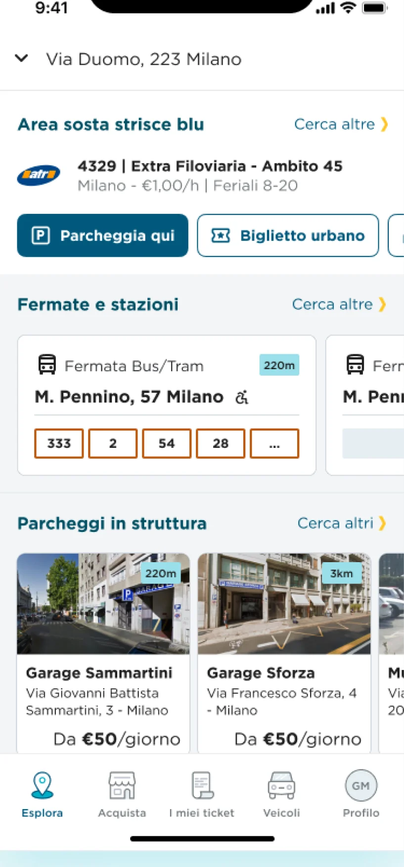
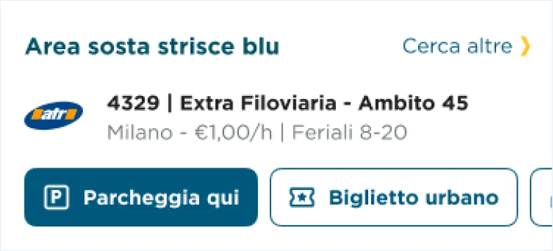
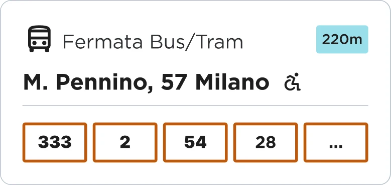
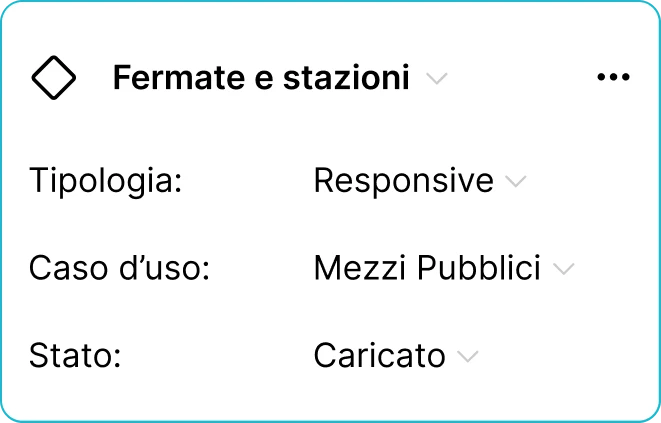
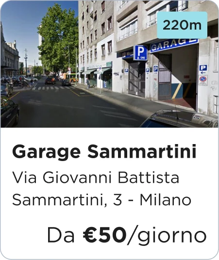
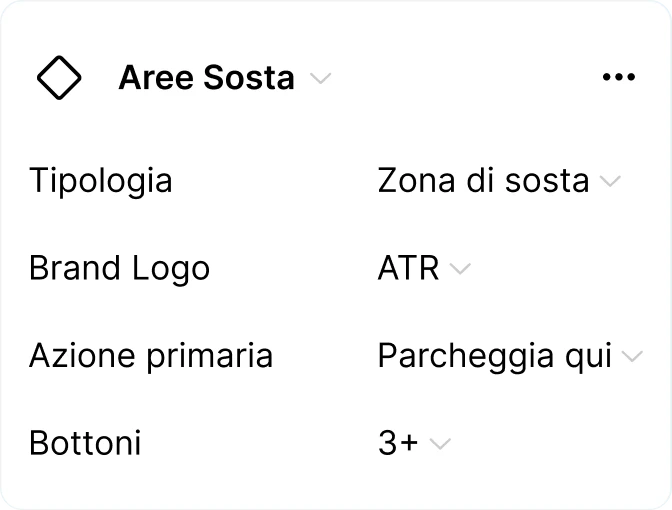
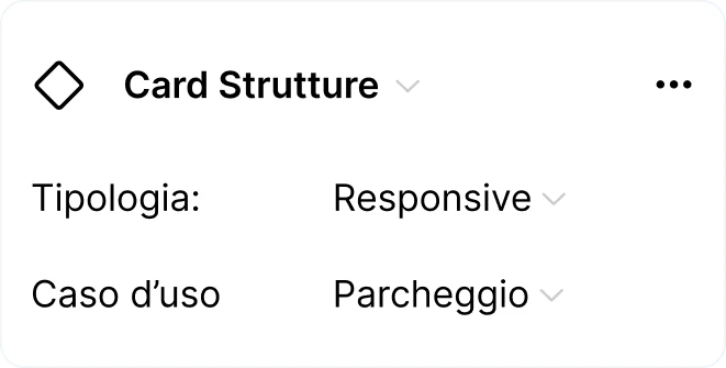
Design system: each card ships with its variants (type, use case, state), the same pieces every service screen is built from.
Principles
System Thinking Across Two Realities
Cross-Team Alignment
Worked directly with MooneyGo's product team and MyCicero's engineers: two organisations with different priorities that needed one shared direction, not just one shared codebase.
Design System
A component system built to absorb new services without forcing existing users to relearn the interface each time one launched.
Continuity Over Novelty
Every new pattern was tested against one question: does this still feel like the app people already trusted, or does it feel like a replacement?
Service Redesign
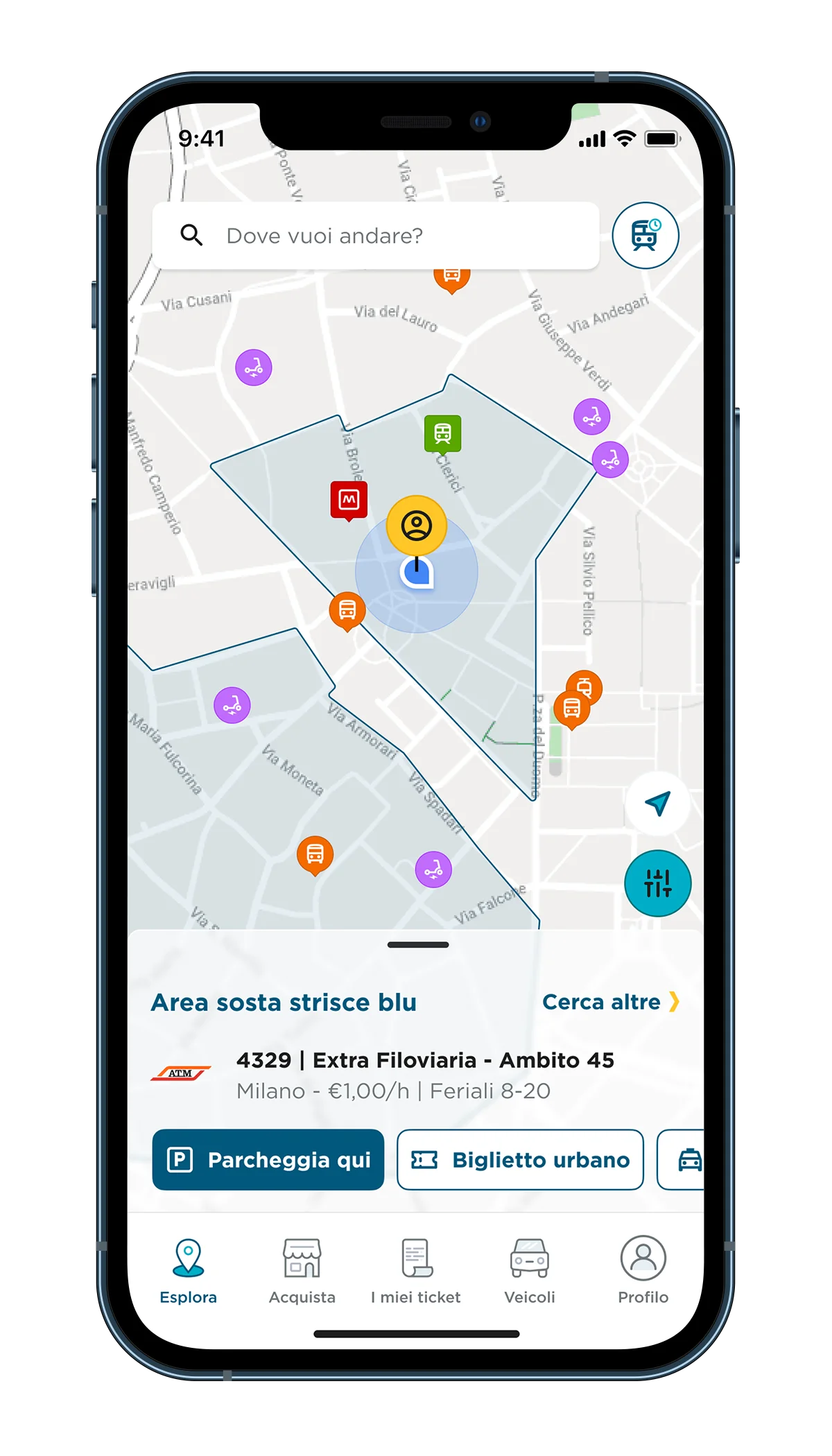
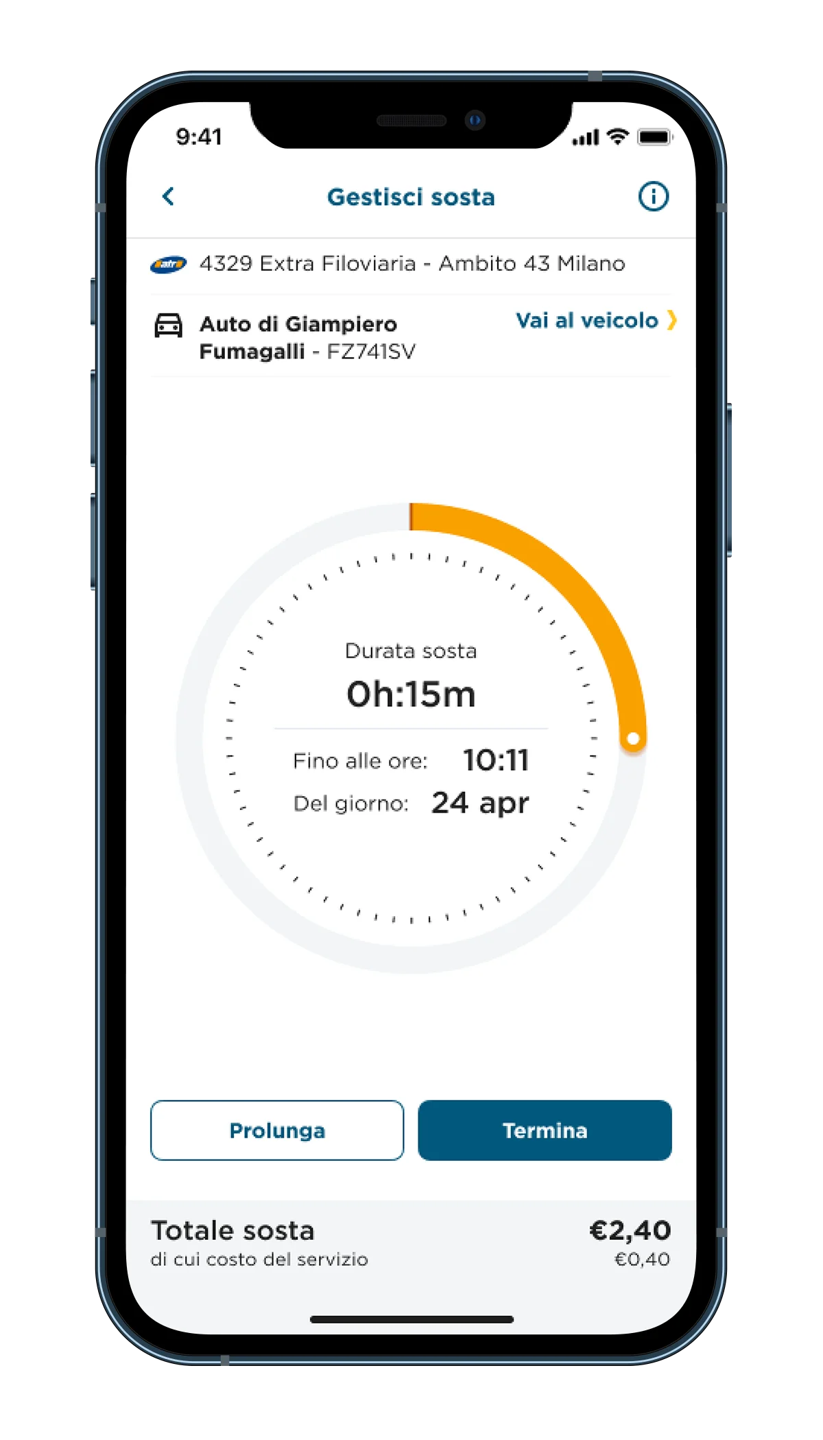
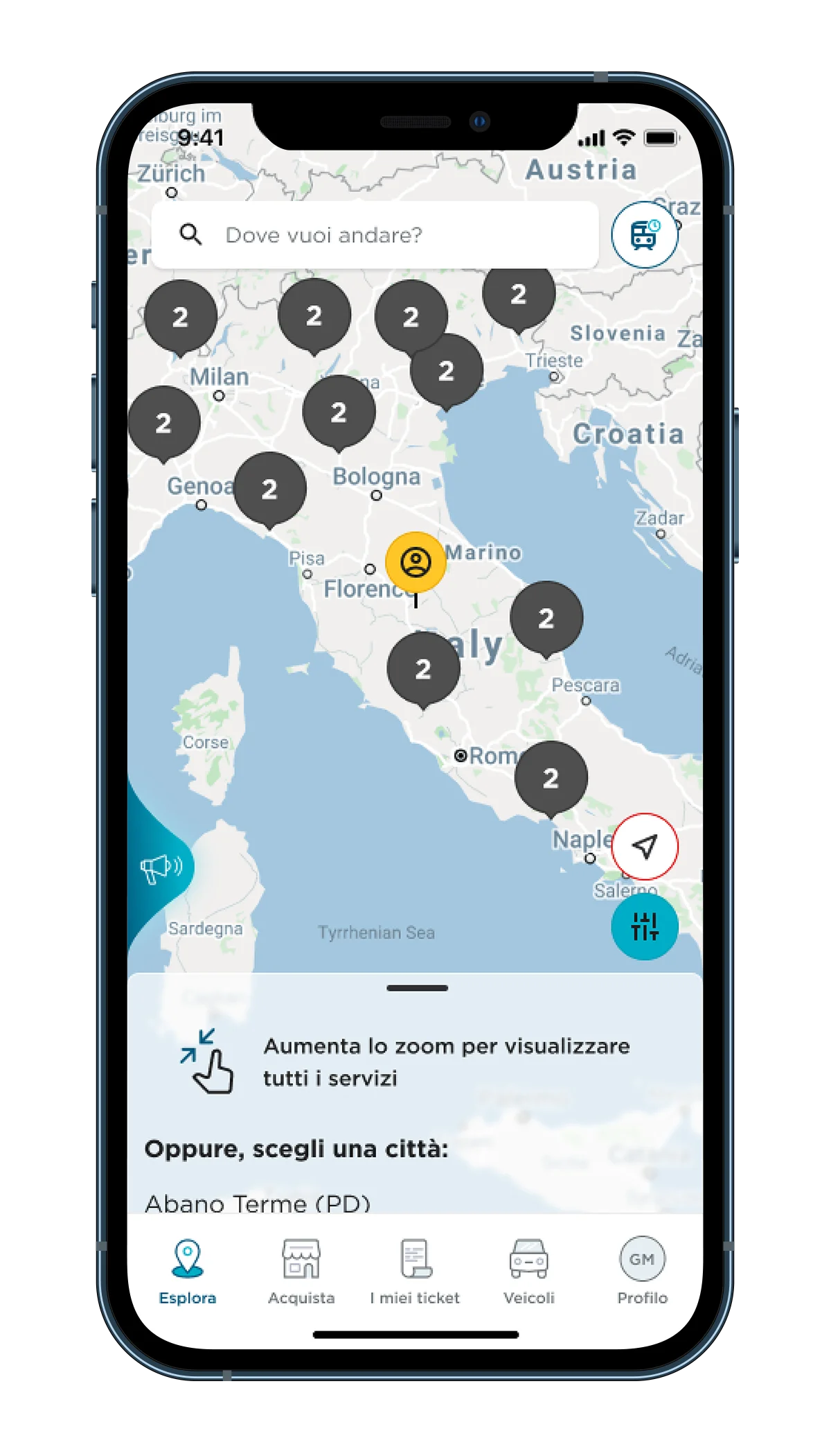
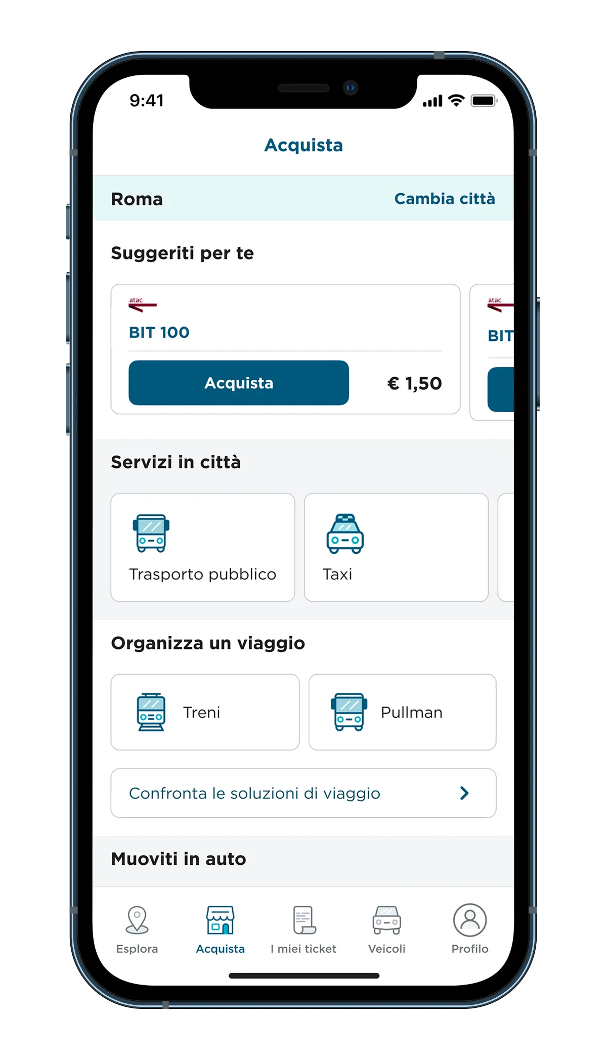
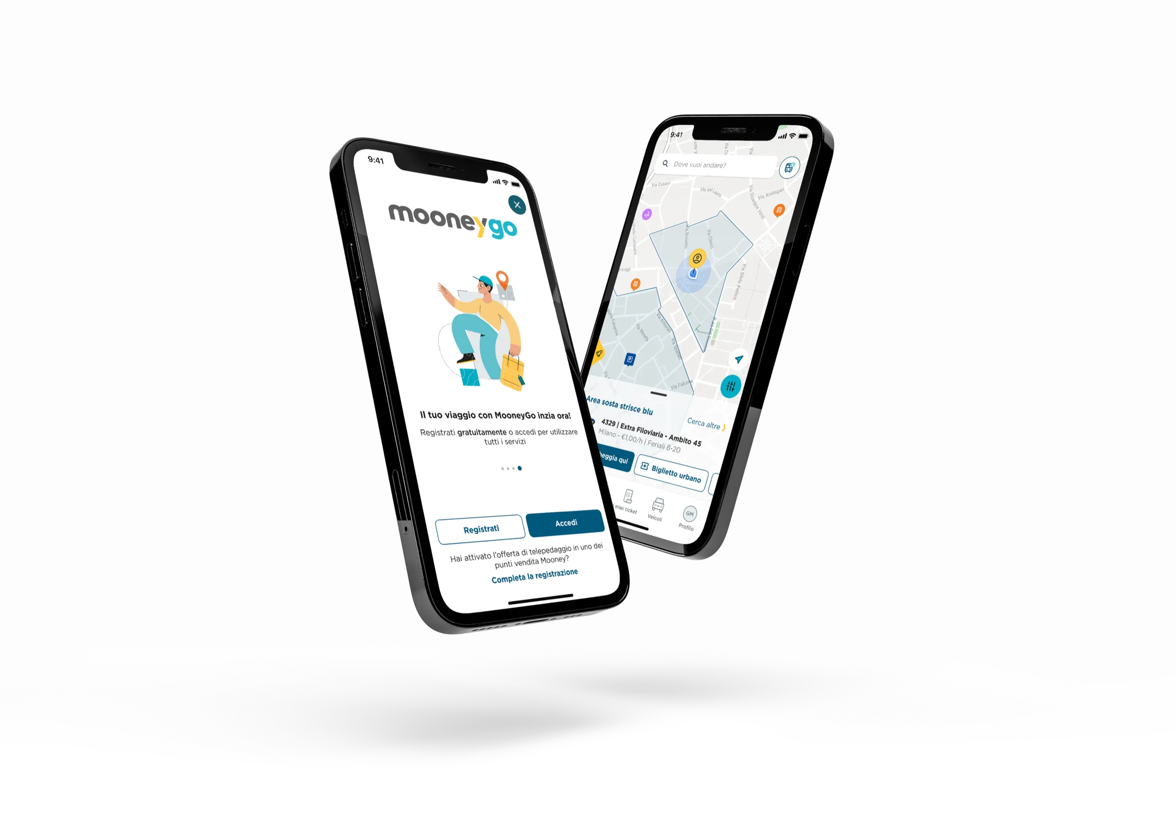
Parking, ticketing, tolls, and sharing: each flow rebuilt against real usage patterns, not assumptions about what 'better' should look like.
What I Learned
Design as a Bridge, Not a Rebuild
The lesson wasn't about interface design. It was about what happens when you change a system underneath people who never asked for the change. The work that mattered most was invisible: the parts that stayed exactly the same on purpose.
MooneyGo was named Consumer Product of the Year 2023, a signal that the market read the transition the way it was designed to be read: as continuity, not disruption.
Consumer Product of the Year 2023, voted by consumers.

One design, many brands.
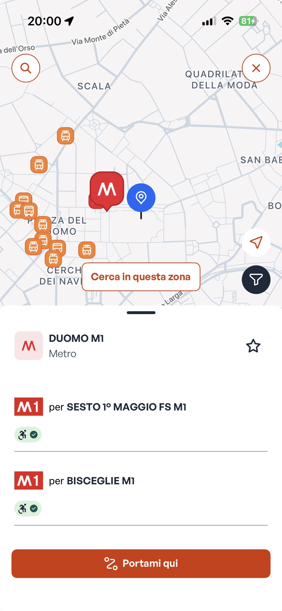
The UI base and component library I designed for MooneyGo didn't stay with one brand. The app is sold as a white label: ATM, Milan's public transport operator, runs it under its own identity, and so do Autoguidovie and other mobility providers.
It's the clearest proof the system was built for services, not for one logo: a new brand on top, the same structure underneath.
Credits
- Client
- Sisal · Mooney
- Agency
- Direct
- Role
- Lead Product Designer
- Scope
- UX · UI · Design system
- Team
- MooneyGo product · MyCicero engineering
- After
- White label for ATM, Autoguidovie and others
Let's talk
Need this kind of thinking on your next project?
 Omar Mootamri
Usually replies within a day
Omar Mootamri
Usually replies within a day
